Exhibit C · Selected work
A national bank

design system · brand guidelines
A design system that signals renewal, rolled out across every retail customer touchpoint.
What the brand needed
A national bank is one of the few brands everyone in a country carries in their pocket. This one was well known, easily recognized, and starting to fray at the edges the way big brands do: every department making its own calls, consistency eroding one artifact at a time. What it needed was not a new face. It was law and order for the face it had: one set of rules that every card, branch, ad, and app screen could follow without a designer in the room.
What we built
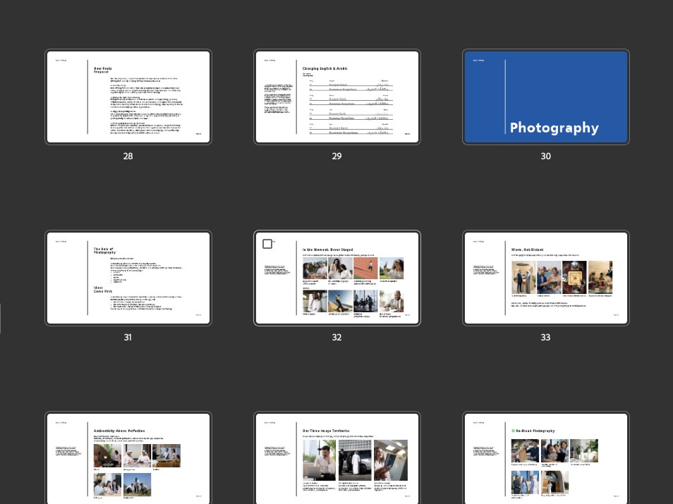
A complete design system, written down. The logo codified with its story intact (a ring opening into an Arabic letterform: unity, continuity, the bond between a bank and its people), with variations specced for the places logos actually live: embossed on a card, stacked in a vertical space, shorthand for an app icon.
Around it, the whole rulebook: clear space, backgrounds, the do-nots, co-branding law for partner lockups, a color architecture that runs from the two blues and the orange accent down to segment palettes so each customer tier keeps its own look without leaving the brand. Typography and production specs included, print to pixel.
What changed
Renewal you can see, rolled out across every retail customer touchpoint. The system’s real product is speed with consistency: the next campaign, the next branch, the next screen starts from the same rules, so the brand accrues instead of drifting.
Start with a Brand Checkup.
An hour with both founders, then a written report: what is working, what is broken, and the three fixes that matter most, in order. The report is yours to keep, whatever you decide next.